Campaign Overview
SNCHI started behind the lens—capturing stories through skin, breath, and motion. After 15+ editorial features, the vision evolved. SNCHI SKIN turns that same emotional depth into skincare: intimate, intentional, and rooted in ritual.
Challenge
Transform an image-led brand into a product experience—without losing the tone, texture, and editorial essence.
Goal
Design a visual and brand identity for SNCHI SKIN that feels like a natural extension of its photographic origin—sensual, refined, and resonant across every platform.
My Role
Creative Director
Art Direction
Copy Writing
Photpgraphy
Logo Design
Asset creation

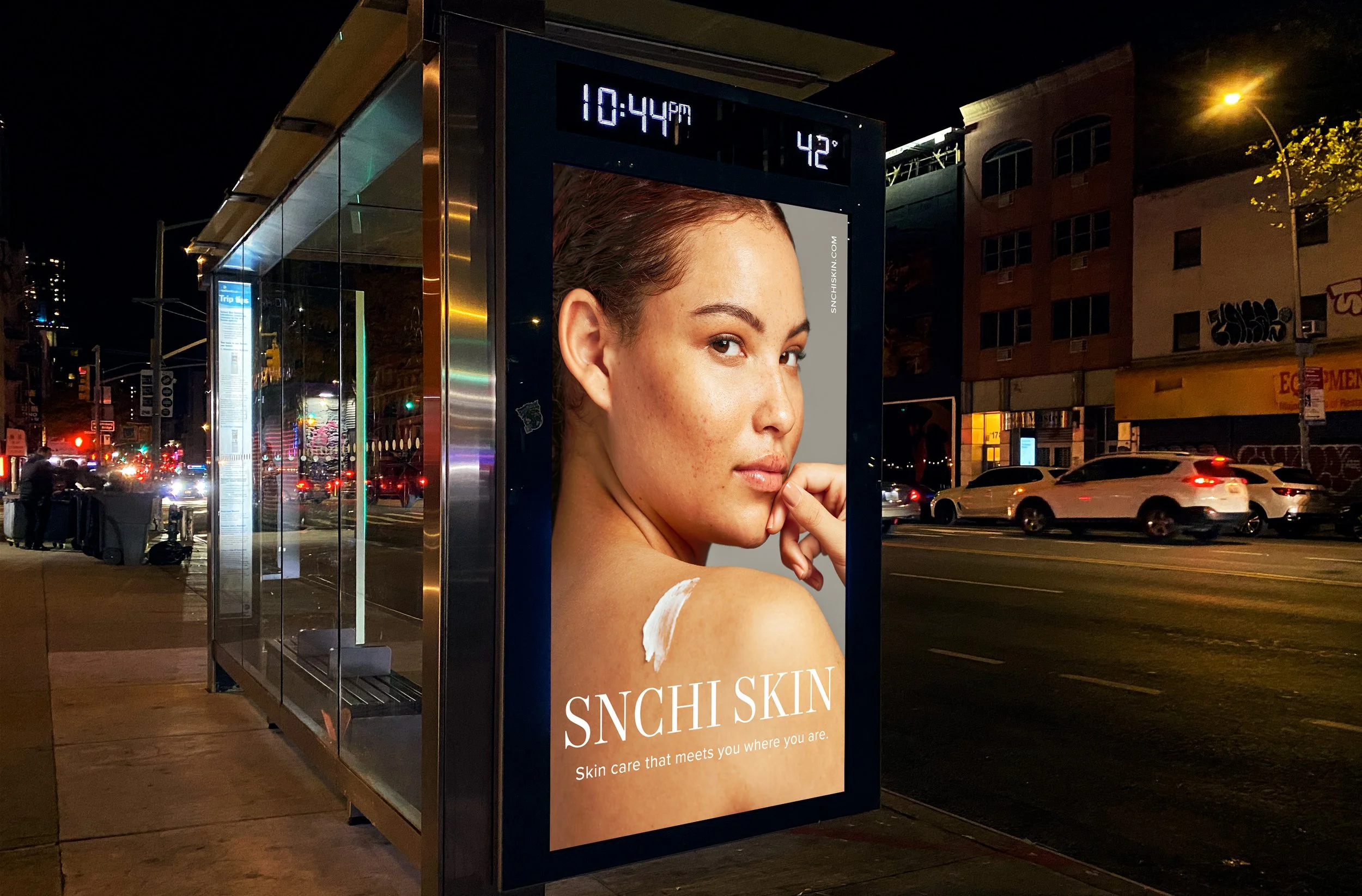
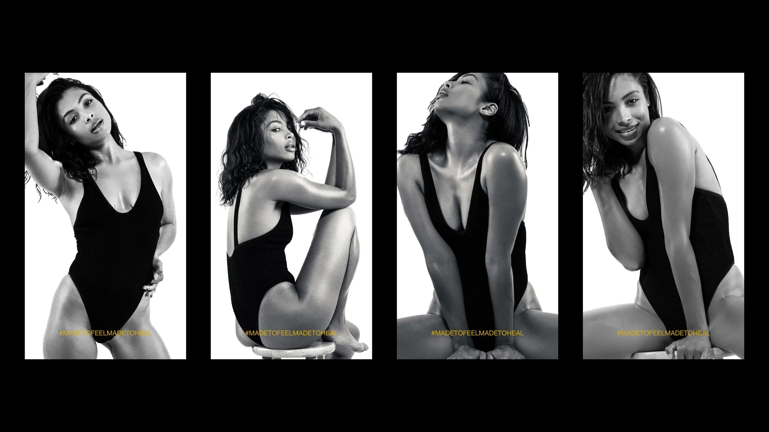
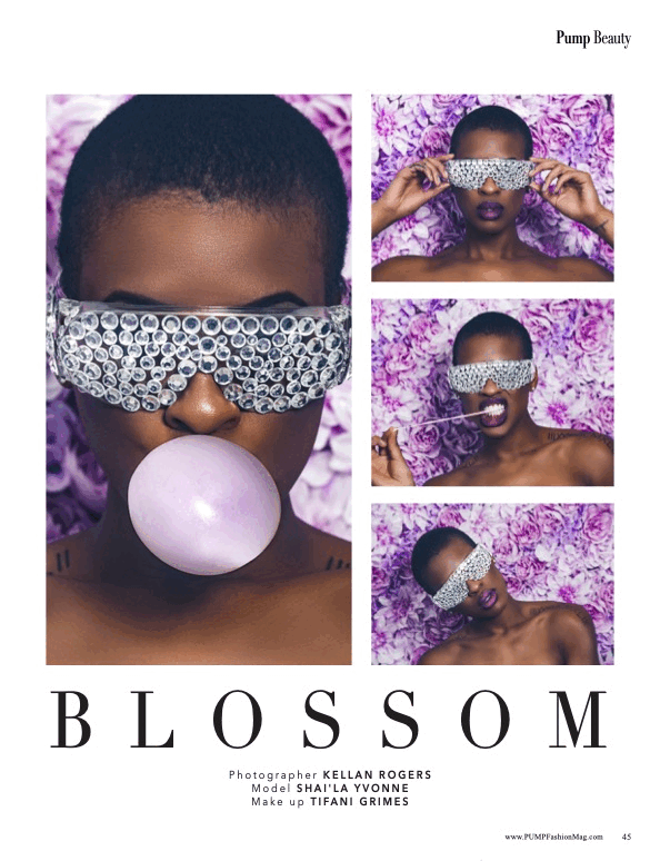
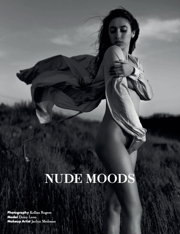
The Evolution of Intention
| BEAUTY EDITORIALS
Where the beauty began.
Editorial work was the foundation, where beauty, sensuality, and skin met the lens. SNCHI SKIN carries that momentum forward, translating emotion into care and high-concept imagery into daily, relatable rituals.
Bringing the Studio to Your Skin
| Branding Beauty
Craft an identity.
A logo grid ensures the SNCHI SKIN mark is balanced, precise, and versatile across applications—reflecting the brand’s commitment to intentional design and clean, minimal aesthetics.

| Editorial typography
Fall for the right type.
Mort Modern brings refined, editorial elegance, echoing SNCHI SKIN’s studio roots. Proxima Nova adds warmth and approachability, balancing sophistication with human clarity. Together, they feel both elevated and inviting, just like the products.

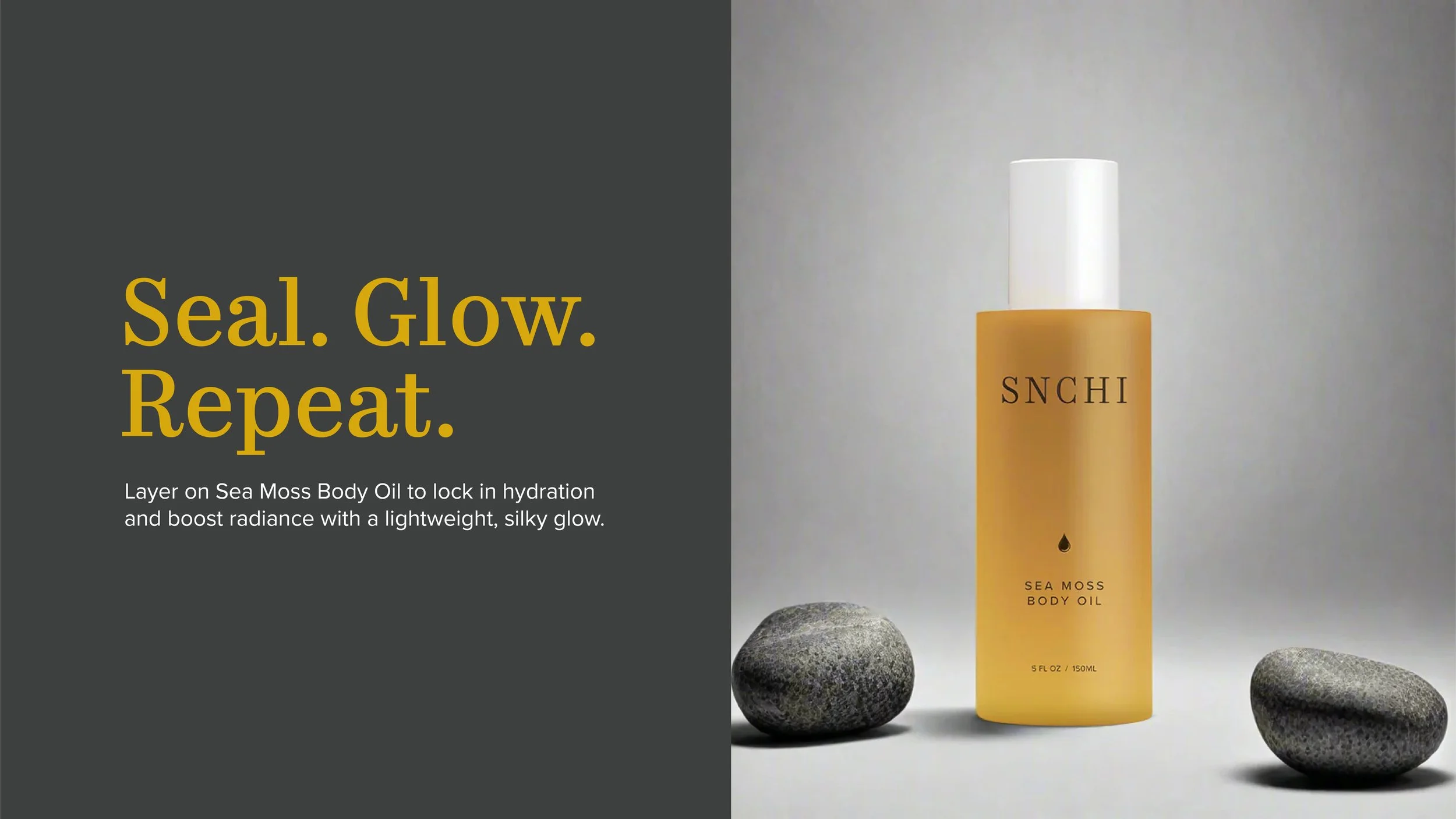
| Elegantly Grounded
Colors that make it easy.
This palette captures SNCHI SKIN’s essence — grounded grey, rich depth, warm gold, and soft white — reflecting intimacy, warmth, and refined minimalism.

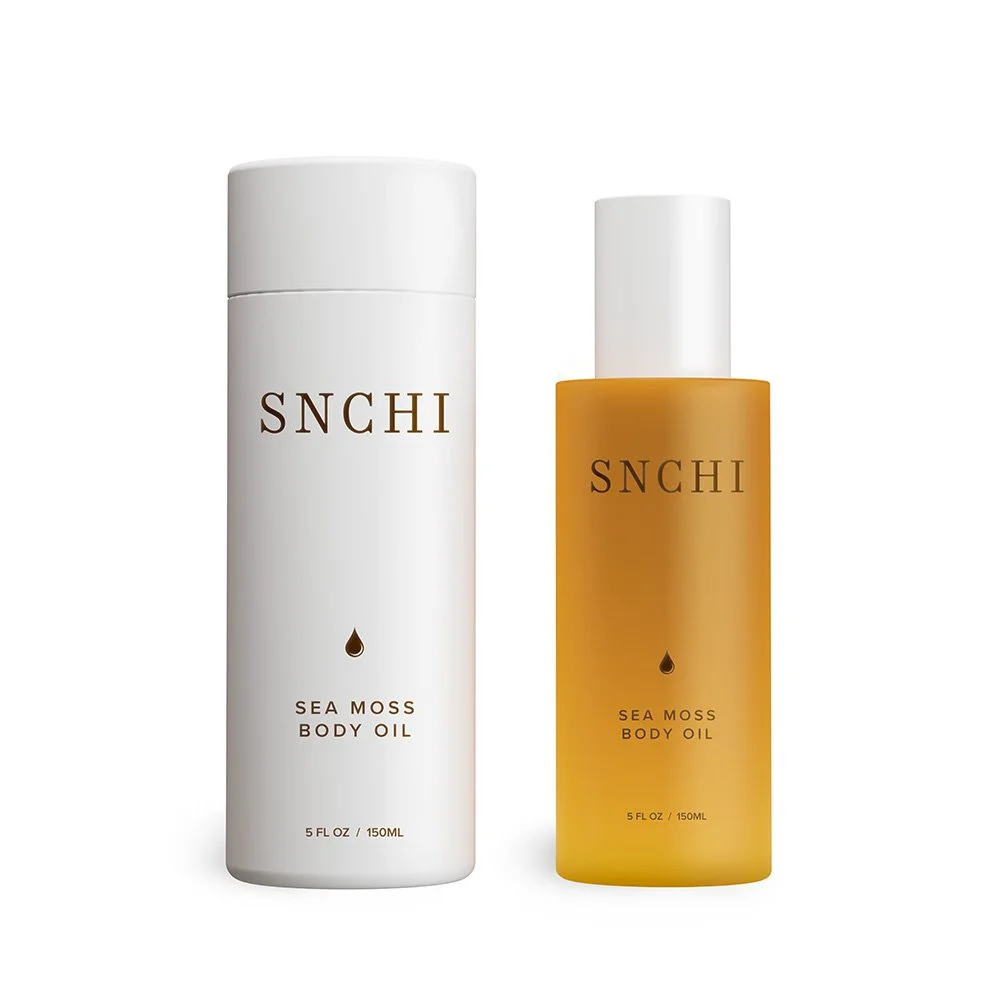
| Photos + 3D Rendering
A step beyond the frame.
Collaborated with a 3D renderer to translate my product photography into dimensional, hyper-real visuals. Together, we merged real texture and form with digital precision — showcasing SNCHI SKIN’s minimal, high-touch aesthetic in a fresh, elevated way.